Inala
//
Packaging
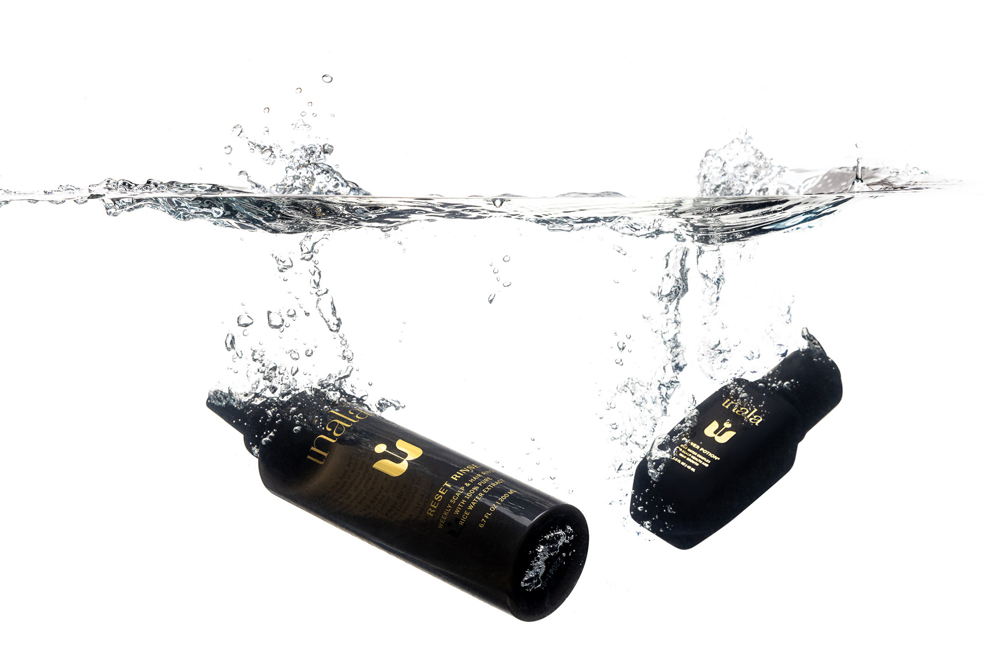
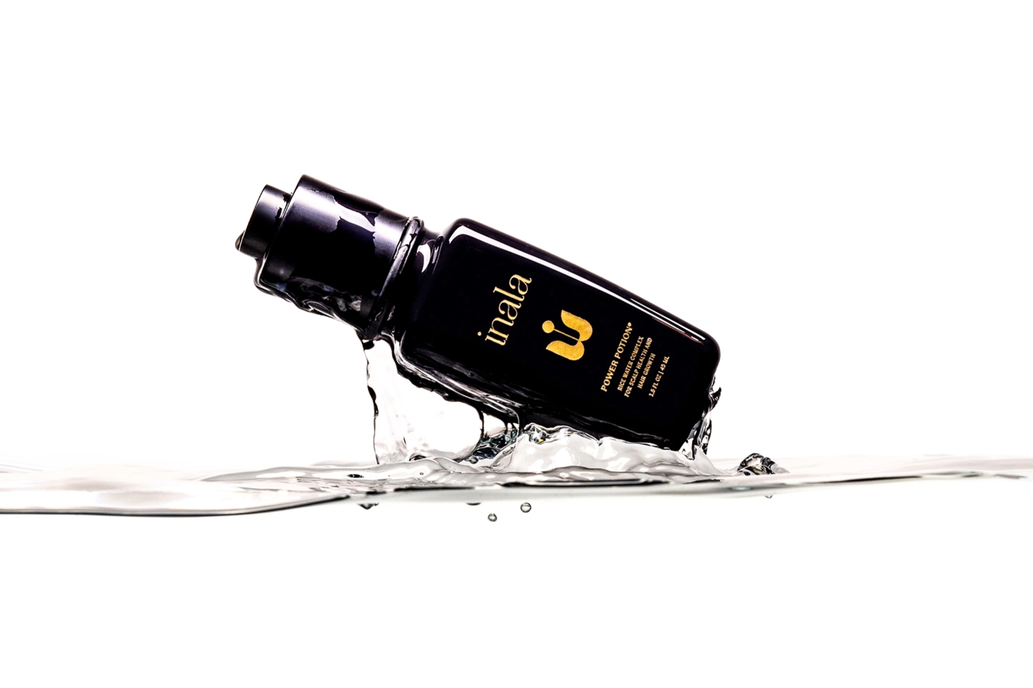
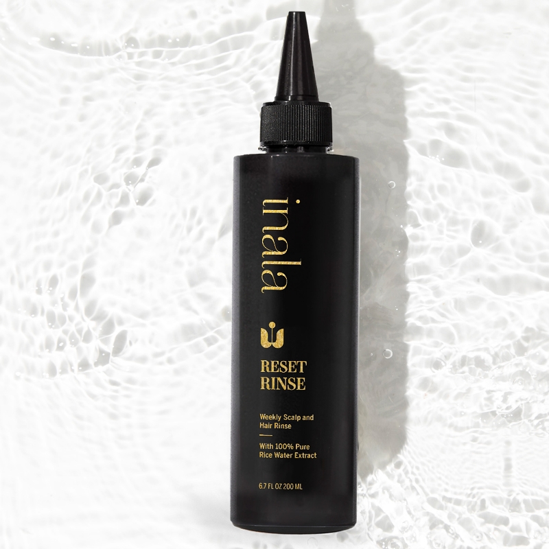
Skaggs redesigned Inala’s packaging, delivering a sleek, playful interface as part of the updated brand look. We redesigned their color palette, updated their typefaces, and created a pattern based on their logo: a distinctive “i” emerging from a stylized lotus, symbolizing purity, strength, and rebirth. The logo is both easily recognizable and emblematic of the brand’s virtues.


Project Details
Team
Courtney Mattson
Designer
Evelyn Lemma
Designer
Client
Industry
Services
No items found.
Related Work
No items found.
