Conversations
What we're saying, what's being said, what should be said.
The Difference Between Owning a Story and Telling It
The real test of a brand isn't whether it has an identity. It's whether that identity means something to its audience.
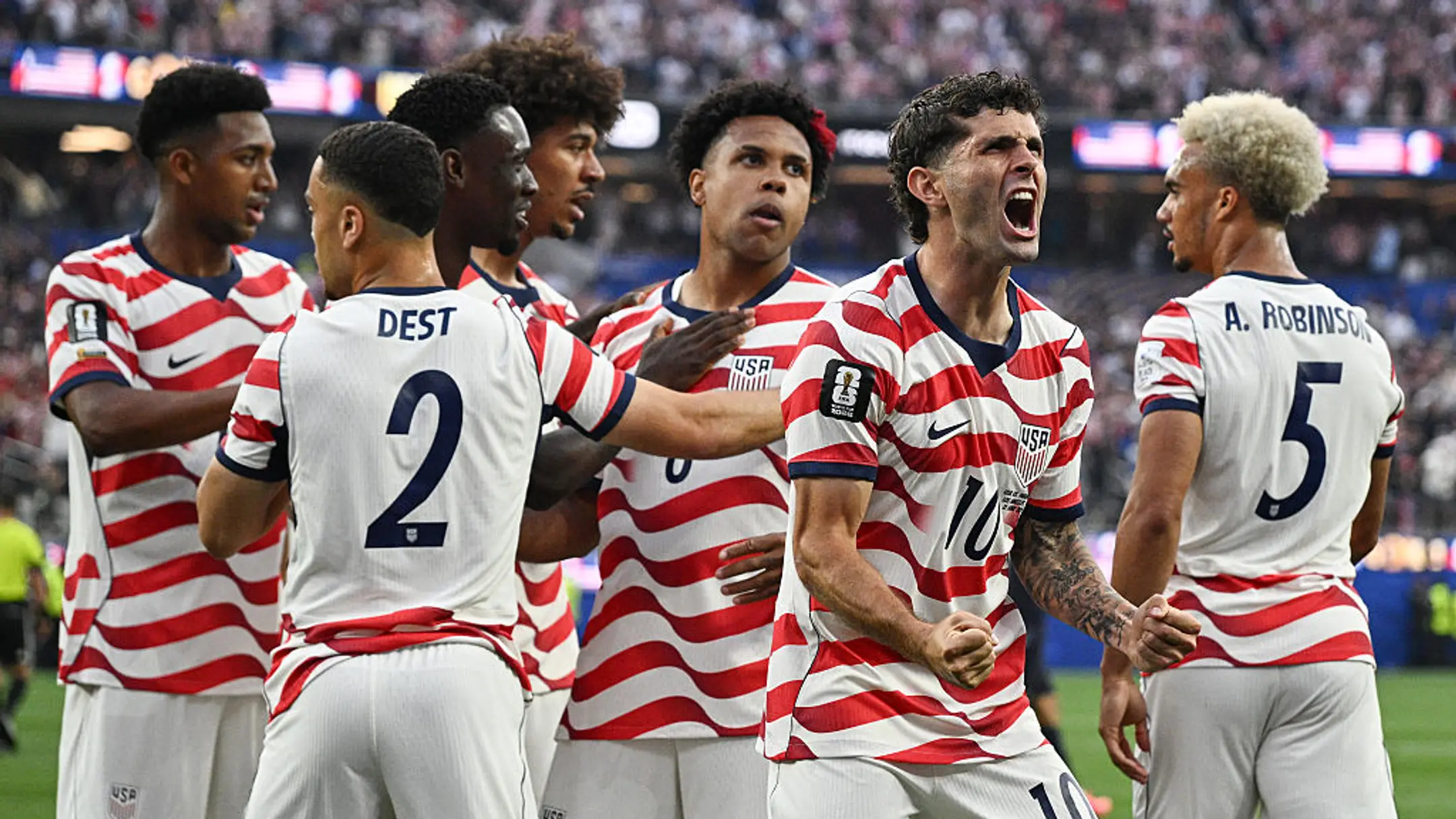
I wanted to follow up on my post from last week, where I wrote about the USMNT’s jersey and why it mattered. Not because of the design — though I think it's the best American football has ever produced — but because of what the players said about the 2022 Qatar edition: “it didn't represent us”. Four words that name exactly the gap between a brand that knows what it is and one that doesn't. The jersey is never just a jersey. It is a signal, and when it's right, the players wearing it feel it. When it's wrong, they feel that too.
I want to push that argument in a direction I didn't go in that piece. Because there's a difference between a brand expressing its identity well, and a brand expressing its identity so well that other people start acting on it without being asked.
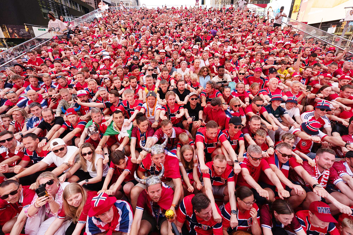
Norway hasn't been to a World Cup in 28 years, and that's got the entire country rowing. They sit down together, a drum beats, and they pull on imaginary oars while chanting "Ro!" It started with the supporters' group Oljeberget ahead of this tournament, rooted in the 1994 song "Alt for Norge." The gesture, though, goes back further. As a Norwegian fan explained on CBS Sports, “Vikings rowed to shore before battle, took in their sails, picked up their oars, and that was the moment before everything. The row isn't a celebration; it's a signal that they're going in”.
Here's what makes it worth talking about: nobody at the Norwegian federation choreographed or planned this. The chant has taken over Times Square. Norwegian politicians paused a parliamentary session to do it, with the chamber's speaker setting the rhythm. The clips have millions of views, with people from other countries saying on camera they wish their own fanbase had something like it.
That's the part most brand work never produces, an identity so intense that strangers extend it on their own, without a brief, without payment, without being told to.
The jersey explains why the chant has somewhere to land. The home shirt is red — Norway's unmistakable color. Across the chest runs a deep navy cross outlined in white, a direct reference to the Norwegian flag. Inside the cross is an elaborate knotwork pattern — not printed on, but woven into the fabric. The pattern is the Urnes style, inspired by the Urnes stave church, the oldest stave church in Norway and a UNESCO World Heritage site. Ancient Norse design translated onto a football jersey in 2026.
Then there are the numbers and names on the back. Nike designed a bespoke font inspired by Elder Futhark — the traditional Norse runic alphabet, the same writing system that forms the basis of Icelandic, the living language closest to Old Norse. Sharp angles, straight lines and distinct geometric shapes that give every character an ancient yet fiercely modern quality. The original 2024 version was banned by FIFA for being too intricate to read on the pitch. Nike redesigned it, simplifying the forms but keeping the identity intact. The result is a font that looks as if it were pulled from Norse mythology yet still passes regulatory requirements. The away jersey goes further. All black, with Nike drawing inspiration from Viking Berserkers, the frontline Viking warriors known for explosive, fearless intensity.
Every decision made points to the same place. The jersey. The font. The knotwork. The away kit. The fan chant. The parliament. Times Square. All of it is saying the same thing, in the same language, without a single word of explanation. That's an identity that becomes a brand's Core Truth, not just a brand asset. Norway's federation didn't invent the meaning behind the row. What they did was build everything else, the jersey, the font, the kit, in a way specific enough to reactivate it.
Scotland has just as deep a well to draw from — tartan, the thistle, the Saltire, centuries of clan history — and one of the most well-known support groups in the sport, the Tartan Army. But their 2026 kit is a standard template with an embossed Saltire and a salmon pink away shirt. You could swap the badge for almost any country's and lose nothing. The raw material was never the variable. What it actually builds from it is.
The test worth applying to your own brand isn't "do we have a rich history." Almost everyone does. It's whether what you put into the world is coherent enough that someone else would extend it without being asked. If the answer requires an activation calendar, a campaign, or an explainer, the identity underneath probably isn't there yet.
What does your brand go back to when it needs to remember what it is?