Conversations
What we're saying, what's being said, what should be said.
Weniger, Aber Besser. The Best Look Inevitable.
The best brand expression doesn't look designed. It looks inevitable.
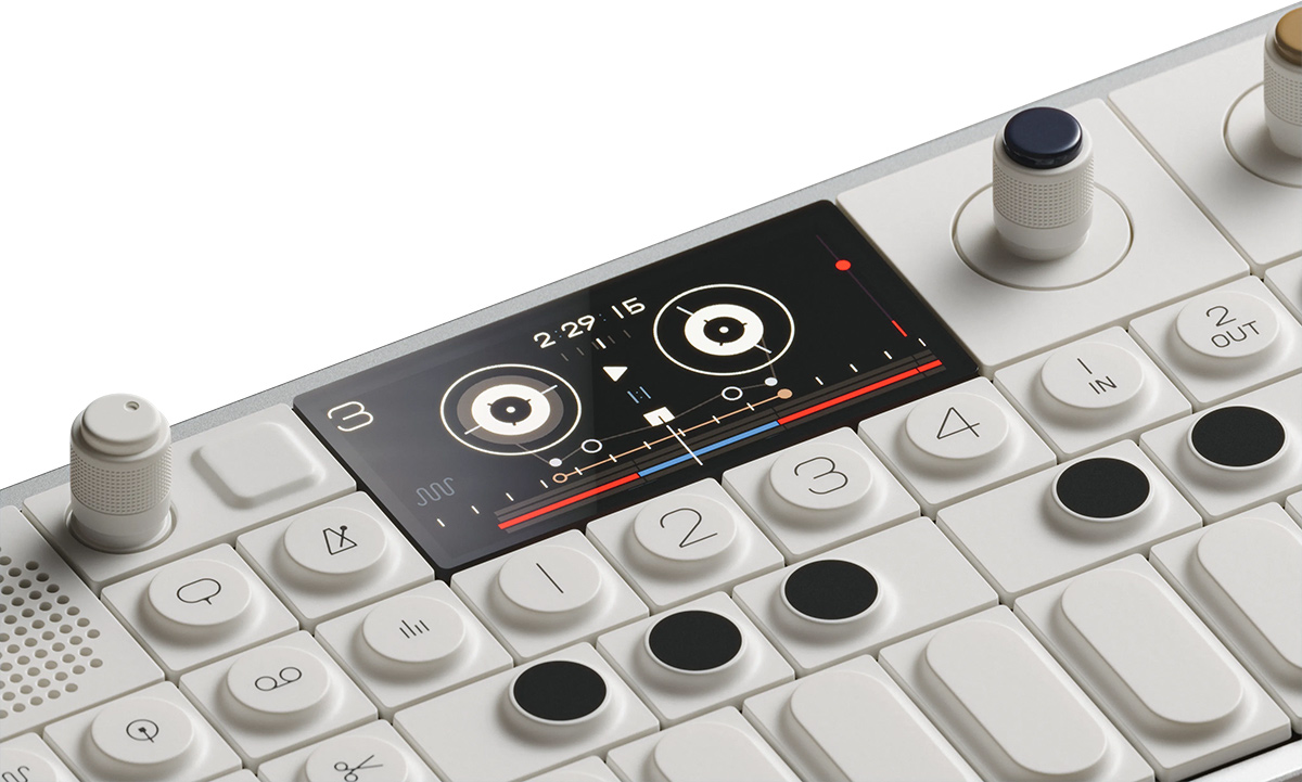
Enough football for now. Let’s get back to design. I was at the MoMA last weekend to see the Marcel Duchamp show (interesting) and walked through the MoMA Store. Something caught my eye that I hadn't seen for some time: the OP-1 Field by Teenage Engineering.
I couldn't help but pick it up and just admire it for a few minutes. I spent the rest of the afternoon thinking about it.
That's the test. When a designed object makes you stop and stare not because it's flashy but because it looks inevitable — like it could only have been this — you know you are looking at something created by people who knew exactly what they were building before they designed a single aspect of it.
Teenage Engineering is a Swedish company founded in Stockholm in 2005. They make synthesizers, samplers, and audio instruments. Their OP-1 Field, OP-XY, TP-7, and Pocket Operators are some of the most considered objects in consumer electronics. Not the most powerful and not the most feature-rich. But certainly the most considered. Every control is where it needs to be. Every color placed with intention. Nothing is borrowed from another product's aesthetic. The form is an argument: this is what a portable synthesizer should be, expressed with as much precision as the technology allows.
Their work is so visibly rooted in Rams' philosophy that when they released the OP-XY, the design community immediately recognized the lineage. The headline on the product page for the OP-XY reads "liebe auf den ersten blick" — German for "love at first sight." They know exactly what they're invoking. The Rams connection isn't incidental. It is the point of view.
The phrase is "Weniger, aber besser." Less, but better. It was Dieter Rams' personal motto, the one he used to describe what he was trying to do at Braun for 34 years. Not less as reduction. Less as precision. Every decision in service of the thing. Nothing added that doesn't belong. Nothing removed that does. The goal is not minimalism. The goal is inevitability.
Rams didn't work in a vacuum. The principle has a lineage worth tracing because the lineage is really the argument.
Louis Sullivan gave us "form follows function" in 1896. A building's exterior should be determined by its purpose. The form is a consequence of the purpose, not a decoration applied on top of it. Sullivan was working against the ornamental excess of the Victorian era (so were Duchamp and Dadaism) — the impulse to cover everything in detail that bore no relation to what the building actually did. He said, stop. Figure out what it's for, and let that determine what it looks like.
Ludwig Mies van der Rohe took Sullivan's principle and compressed it. "Less is more" — a phrase he adopted from Robert Browning's 1855 poem "Andrea del Sarto" and made the governing philosophy of his architecture. The Barcelona Pavilion. The Seagram Building. Steel and glass stripped to functional essence. Mies wasn't trying to make things smaller. He was trying to remove everything that didn't earn its place, and to discover what remained.
Rams went one step further and changed one word. Less is more implies the endpoint is nothing. Less but better implies the endpoint is the truest version of the thing. You're not subtracting. You're distilling. What remains is more itself than it was before you took anything away.
He spent 34 years applying that principle to objects people used in their kitchens and living rooms. The SK4 record player. The T3 pocket radio. The ET66 calculator. Each one looks inevitable once you see it. The front face of the RT 20 radio slants slightly upward — not as a design gesture, but because it improves the legibility of the controls and casts the sound further into the room. Every decision has a reason. The reason is always the object, never the designer.
Rams didn't design for galleries. He designed for everyday life, because he believed good design should be accessible to everyone, not reserved for people who could afford luxury. He was explicit about this. When asked in later years about what bothered him about contemporary design, he said he was troubled by how much of it was designed to attract attention rather than to serve the person using it.
Jony Ive said so openly. The iPod scroll wheel was the Braun T3. The iPhone calculator app was the ET66. The perforated aluminum casing of the early Mac towers mirrored the grill patterns of Rams' Braun speakers from the 1960s. What traveled forty years and two continents wasn't a style. It was a point of view. Apple didn't copy Rams' objects. They inherited his question: what does this need to be, and what can be removed without taking anything away from that?
Teenage Engineering inherited the same question and answered it differently. Where Apple eventually moved toward near-total surface refinement — objects so smooth they almost disappear — TE kept the joints visible, the screws exposed, the logic of the thing readable on its face. The OP-1 Field doesn't hide what it is. It shows you how it works. That's also Rams. His tenth principle is that good design is as little design as possible — but his objects always let you understand them. The controls tell you what they do. The form tells you how to hold it. Nothing is concealed for the sake of elegance.
The OP-1 is in the permanent collection of the San Francisco Museum of Modern Art. An instrument designed for everyday musicians that ended up in a museum. Rams probably finds that troubling and flattering in equal measure. He designed for kitchens, not galleries. The fact that the objects were good enough to end up in both is the proof.
The brands I keep writing about in this series — BMW, Norway, Virgin Atlantic — all passed the same test, in completely different categories. BMW kept the boxer engine not because it tested well, but because it is what BMW is. Norway expressed a thousand years of Norse heritage in a jersey because that heritage is what Norway is. Virgin Atlantic built a mission statement that worked on three levels simultaneously because Branson believed in something specific and found the words for it.
None of them started with the surface. They started with the true thing at the center and worked outward. The forms are consequences. They look inevitable because they are.
Rams articulated the governing standard for this fifty years ago. The best expression of a Core Truth looks inevitable. Not designed. Not crafted. Not curated. But Inevitable. When you encounter it — whether it's an object in a museum store or a football jersey in a stadium or a mission statement that works on three levels simultaneously — you feel it before you understand it. You stop.
That is the test. And it applies to every touchpoint a brand controls.
What does your brand look like that only it could be?